26

I'm Jin, and I'll be working on the designs for the Stack Exchange sites as they graduate from the beta phase. Each site will have its own unique theme that will reflect its topic. However, all sites will share quite a bit of common elements so they feel like they're part of the Stack Exchange family.

During the brainstorming phase, I asked myself, why do people ride bicycles if they have a choice of driving a car, or why do they choose cycling if there are other forms of exercise? As a one-time bicycle lover myself, I thought about personal freedom, accessibility, low cost and being in touch with the great outdoors.

So for the design, I wanted to capture the feeling of riding a bike, rather than focusing on the bike as an object.

Riding a bicycle is a very personal and independent choice. I wanted the design to reflect that. I believe a hand illustrated art style gives it a more personal touch, and the slightly vintage treatment makes it more timeless. After all, bicycles have been around for a long time.

Since the design is entirely focused on a "feeling," I decided to design a poster for our bicycles site first. That way, I didn't have the distraction of the constraints I normally face when creating a design for the web.

Bicycles Poster

(click for larger version)

Above is the poster I came up with. I believe the texture, color scheme and minimalist style work towards the goal I was aiming for. From there I transfered the visual elements onto the site design.

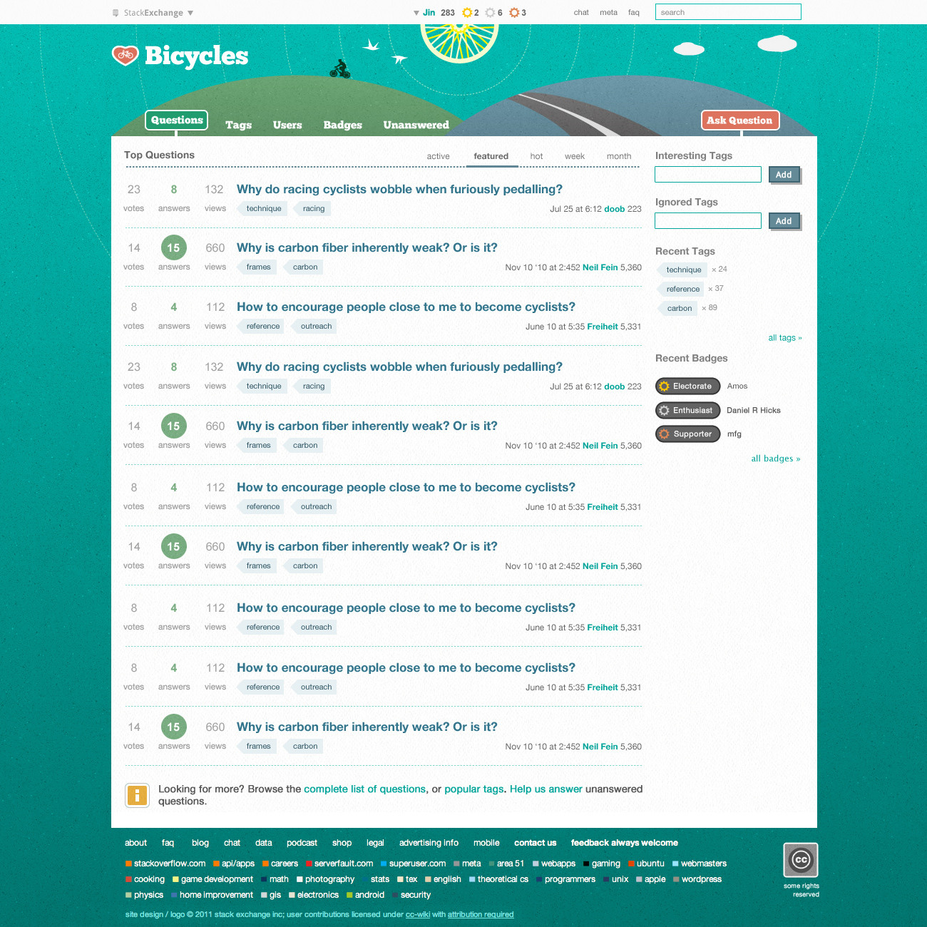
Homepage Design

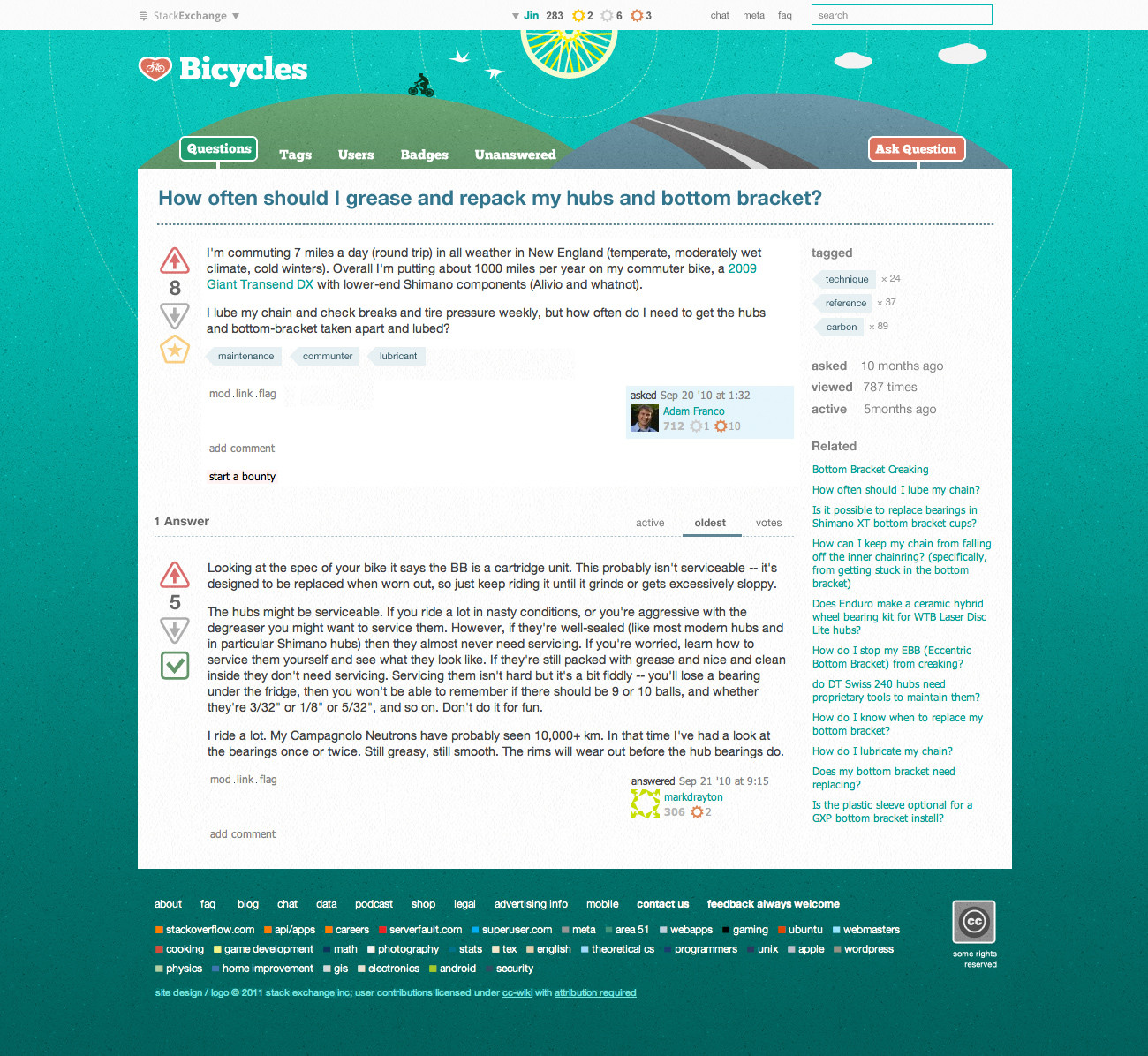
Question Page Design

(click for full res version)

Please keep in mind, not all of the site elements are present in these two mockups. I incorporated some visuals related to bicycles and cycling, e.g. road signs and cogs. But I was careful to not to make it overly "themey." Also, I tried to fit all of the design in one image, so it looks busier than the live site will be.

I'm pleased with the overall design. It did capture the feel I was going after. The site has a unique identity, while maintaining the feeling of the Stack Exchange family.

I'd love to hear your feedback. If there are no major design changes, I'm aiming to launch the site next Tuesday. So an early congrats from me!

44
  • 4
    I love that poster. I'd actually buy a print if you made one available. Commented Jul 29, 2011 at 21:51
  • 1
    @Marc we'll try to make the poster as part of the swag package we're sending out to top users. I definitely planned to have it printed as a real poster.
    – Jin
    Commented Jul 29, 2011 at 21:53
  • 3
    I'd actually pay for a mug - can't have too many coffee mugs. Commented Jul 29, 2011 at 21:55
  • 1
    Can top users get a top-tube (down-tube if you prefer) sticker or two too? Maybe a head-tube sticker? ;)
    – freiheit Mod
    Commented Jul 29, 2011 at 22:01
  • 1
    @MatthewRead: dust off that old bike from the garage and start asking us some questions! :)
    – freiheit Mod
    Commented Jul 29, 2011 at 22:05
  • 3
    Beautiful; this is one of my favorites! Have you considered wheels/spokes or gears for the circle that highlights the number of answers on a question with an accepted answer?
    – Nathan G.
    Commented Jul 29, 2011 at 23:10
  • 1
    @Dori I had a hard time deciding myself. I eventually decided to go with the heart, simply because contextually, it can stand on its own. The wheel is nice as a decoration when it's in the poster or the site but doesn't translate well to other mediums.
    – Jin
    Commented Jul 29, 2011 at 23:40
  • 1
    I prefer the heart; it's a simpler graphic, and the spokes make for a more complicated icon. The heart will also reproduce better when tiny. Commented Jul 30, 2011 at 1:49
  • 7
    The poor cyclist is hunched over in a "C" shape. He's going to hurt his back. Poor guy.
    – Jay Bazuzi
    Commented Jul 30, 2011 at 3:09
  • 3
    I like everything but the heart logo. I very much dislike that element. It gives the whole look a cartoonish feel which is not something I enjoy. Without that element it is ethereal, and perhaps a bit fantastic, in the original sense. But very enjoyable. Find something else for the logo, and I'll be very pleased.
    – zenbike
    Commented Jul 30, 2011 at 10:24
  • 1
    I like it overall but IMO it has too much of an "outdoor"/holidays feeling. I think of this SE site as something more related to the bicycle than stricktly with its evironment. In other words, I think the theme should focus more on the bicycle than with the scenery, the first feeling I had after seeing the layout was that it may give the impression of an SE site for travelers that use bikes. Tough one, and I understand Jin's choice, hope our contribution will help. I love the heart (a bit feminine, but lovely nonetheless) and hate the wheel shaped sun, it is distracting and looks out of place.
    – jackJoe
    Commented Jul 30, 2011 at 11:10
  • 2
    @Jin: I know how hard it is too come up with a design, from scratch without feedback. Please accept this as intended: constructive feedback. I'm not down on your work. I just don't think it fits the site that well.
    – zenbike
    Commented Jul 30, 2011 at 13:41
  • 2
    @zenbike judging from the number of up/downvotes, I say the community approves the overall design direction. As for the strong dislike of the heart logo, you're the only one. "but this doesn't represent what our site is" that's your personal opinion. If I change it to something that pleases you, then someone else may complain. Then what do I do? When I design these sites, my design isn't based on my personal taste but rather a design that has universal appeal. I also don't do design by committees because that approach only produces mediocre work so no one's feeling is hurt.
    – Jin
    Commented Jul 31, 2011 at 4:30
  • 2
    @zenbike I read the comments that are related to the disapproval of heart logo, I only found yours. As for the overall design direction, far more people like it than not. I don't ignore people's feedback, but I also don't make every changes requested, especially if they're based off personal preferences. As I said, even if I did you suggested and someone else doesn't like it, then what do I do? "I like everything but the heart logo" That was your first comment. Now you don't like everything?
    – Jin
    Commented Jul 31, 2011 at 4:53
  • 3
    The mods found out about the design when it was announced in chat publicly, shortly before this page was posted. There is no "secret" process. Your tone right now is confrontational, and this is also contributing nothing to the discussion here; please take this to chat if you want to discuss this further. Commented Aug 1, 2011 at 6:38

6 Answers 6

7

Overall, I really love this design. Anything that sounds otherwise is really really minor details. If we go live with this design exactly like this I'd be happy.

I like the logo, it basically says "I love bikes" to me, which is a sentiment I can go for. I won't be surprised if some people don't like a heart as a logo.

The whole design is a wee bit whimsical, which I like and some won't.

I think maybe you were thinking of a sort of "vintage" thing with the texture, but it also reminds me of a road surface, which is a nice touch.

For the most part your design is about riding the bike, while most of our questions are about the mechanics of the bike. The design looks more like riding on a day off than any kind of commute.

Tiny nits/suggestions:

  1. The two "screenshots" have a different background blue color fade going on. Is that on purpose? Either color scheme is fine, but I slightly prefer the shades on the question view.
  2. As @JayBazuzi pointed out in the comments above, the cyclist is hunched over. It would hurt less to look at that cyclist if they had a straighter back. While it is common to see cyclists hunched over like that, the preferred posture is bending at the hips and keeping your back fairly straight. (because that gives the muscles in your torso more leverage making it easier to keep weight off of your hands, because it's generally better for your back, and in some cases because it's more aerodynamic).
  3. The more I stare at the design, the more it feels like riding on an oppressively hot day where the sun beats down and there's no shade. Maybe a tree somewhere? Or a hint of some water somewhere? I get thirsty looking at the pages
  4. I like the "road sign" details, and was thinking having the accepted answer number highlight look like one would be nice. I'm thinking specifically a european advisory speed limit sign (I believe Australia uses the same scheme) which is white text on a square blue background (rounded corners) with or without a thin white border, like http://en.wikipedia.org/wiki/File:Zeichen_380.svg or the 130 on this http://en.wikipedia.org/wiki/File:Zeichen_393.svg (the red circles are mandatory speed limits). (but with a blue that fits the rest of the color scheme better, of course)
  5. I kinda wish the decoration on tags made me think of bicycles in some way... Maybe something that looks a bit like the downtube company branding some manufacturers use. Most bikes the downtube branding is just straight contrasting color lettering/logos on the frame, but there's a classic style some use where that part of the tube is a different color (often with a little striping at both ends). Like:
2
  • 1
    1) The shades will be consistent. 2) I'll fix that. 3) That's a good point. I had a tree originally, but it was a bit too big. but I'll make some tweaks and bring it back. 4) I prefer the number to stay simple as it is. I feel if I give it the same road sign treatment as the other action items, people may think it's clickable. (I know mods can, but most users can't). 5) I'm not sold on my tag treatment, so I'll definitely play around based on your suggestions. But generally, I prefer to keep the tag visual simple, since they're repeated so many times on the site.
    – Jin
    Commented Jul 30, 2011 at 19:06
  • 4) For the number, I meant the number for an accepted answer on the list view, where you now have a green circle. Basically I was suggesting changing the green circle to a blue square. 5) I was thinking a very simplified monochrome version of that kind of treatment.
    – freiheit Mod
    Commented Jul 30, 2011 at 20:08
5

The heart logo works for me, however I do have what can hopefully be received as constructive criticism of the design work.

'Slightly Vintage...'

I think you will find that trains have been around for a lot longer than bikes and trains project an image of cutting edge high speed rather than folksy steam. I think that, as far as bikes are concerned, you should take note of how much more sophisticated and high-tech bikes are than anything else on the roads. Carbon fibre is commonplace on bikes, not so on cars, they are stuck on steel and only just dabbling with aluminium which is old-tech for bikes. Bikes also can have electronic gears and time-trial machines use every aerodynamic trick in the wind-tunnel-hand-book. Fabrics for cycle clothing are also light years ahead of anything in the High Street or catwalk. LED lights were pioneered on bikes and are just making their way onto cars. Put simply, although we all have childhood memories of cycling, cycling is essentially a high-tech game with nothing vintage about it.

'Solo cyclist'

I have been out and about on the bike today and I could not help but notice how many people were cycling in groups. When it is sunny weather it seems there are more people in groups than going solo. I think that the site is about community and that could be reflected by a diverse selection of riders on different styles of bikes. Inclusiveness is part of what the questions and answers are about.

Why Off-road?

The majority of questions on the site seem to be from people that ride for a mix of utility and pleasure. I personally view off-road mountain-biking as a bit 1980's, nowadays bikes are to be found in the city and along canal towpaths rather than off-road, as was the fashion when the 'car was king'.

What is wrong with sky blue skies?

Call me picky, but I like blue skies to be blue. Can we experiment with some different gradients? 'Simpsons' title sequence has a blue sky that is blue sky colour, as does the view out of my window now. There are lots of blues that say sky, I am just not feeling it with this one.

Heart Logo and buttons

I like the heart logo, however I feel we could do a bit more with the existing bicycle road sign colour palette. Around here (UK) we have signs in blue, e.g:

enter image description here

With road signs red means stop, take attention, hazard ahead and so forth. Green has its own meanings, however, for bikes that is the colour of a cycle lane, i.e. the tarmac is painted green. I feel we already have a few colours that can be made to work with the design.

For instance, the heart might work really well if in green. This will mean that the favicon does not look like some dating site or my little pony site. This may appease the naysayers.

Randomly thrown in ideas

I am an admire of the cycle artwork that goes with 'Critical Mass' rather than Tour-de-France wannabee-ism, as you get in 'Future Publishing' style magazines. Andy Singer's series was excellent as were Ken Avidor's 'Road Kill Bill' cartoons that could be found in 'Carbusters' magazine a decade ago when it was underground, edgy and subversive.

The site is also a global affair the sphere-style hills could have some cartoon-ified coastlines that are notionally of continents. We could play with some ideas of scale.

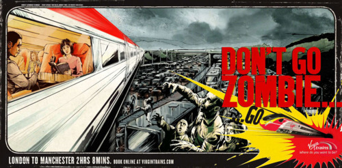
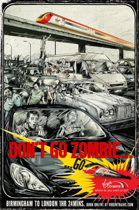
I was impressed by the UK train adverts that Virgin put out a while back. We could do something similar with bicycles going overhead of gridlocked traffic, maybe doing the black and white grey for the cars and true technicolor for the bikes:

enter image description here

enter image description here

And finally...

We haven't decided on a strap line, 'It is about the bike!' might work as a working title rather than 'lorem ipsrubbish' that designers pretend to work with.

4
  • @ʍǝɥʇɐɯ Thanks. By "vintage" I meant art style, not on the bike itself. That's why I didn't use a Penny-farthing for the bike the rider is on. There are undoubtedly many styles of bikes, with various technologies, just as there are different usage of bikes. People ride bikes different too and in different settings. My design goal is not to appeal to a single type, or include all of them. I believe something more generic and simple works the best.
    – Jin
    Commented Jul 30, 2011 at 20:33
  • 1
    yeah but we got a loner cyclist image problem imho. Commented Jul 30, 2011 at 20:35
  • 1
    I do agree a little with @ʍǝɥʇɐɯ about the loner aspect. For me a significant reason (in addition to "freedom, accessibility, low cost and [...] outdoors") is connection and community. It's a surprisingly social way to get around. Often done in groups (at least 2), and even when on my own I'll often wave at other cyclists and say "hi". Because it's not inside of a metal box it's a much more connected way to get around.
    – freiheit Mod
    Commented Jul 30, 2011 at 20:52
  • @ʍǝɥʇɐɯ: Except for the heart logo, I agree.
    – zenbike
    Commented Jul 31, 2011 at 3:10
2

First, @Jin, I appreciate your work as the designer, and I know that presenting anything based solely on one's own ideas is difficult.

However, the overall feel of this design is more fantastic than I would prefer, especially since we are supposed to be a site for solid questions with concrete answers.

Pros:

  1. The color scheme gives a nice soft feel to the page. It reminds us that we are all here because we have one thing in common, at least.
  2. It's rider centric, and not machine centric only. It doesn't leave anyone with the impression that all we care about is what you ride, or how much it cost.
  3. It does a good job of incorporating bicycle based elements without every button being a mini component of some kind.

Cons:

  1. I hate the heart as logo. I'm not a 13 year old girl drawing the headbadge of my bike on my Peachie cover, and I don't want to look like one. I would be embarrassed to use that as a logo or link badge on most sites I frequent. And while I don't want to prevent 13 year old girls from participating, neither do I want to turn over our brand identity to one.
  2. I would much prefer our logo to look like a headbadge, or some similar cycling themed item. C'mon, it's our logo! Shouldn't it define bicycles.se better than that?
  3. I'd like there to be some element that reminds us that there is a technical side to cycling; that riding is gestalt of man and machine, and that in a way cyclists the original cyborgs. This captures the zen side of cycling quite well. What about the other side? Are we ignoring it? Because most of our questions are far more focused on the technical than the zen of it all...
  4. As was stated in the earlier answer, fix the cyclist's position. He looks in pain. And a tree or 2 on the page would be nice.

enter image description here enter image description here

16
  • 1
    While I do like the bike-in-heart logo a lot, I also like your idea of a logo that resembles a headbadge. What graphically defines a headbadge? I've seen a lot of variety and the heart logo could easily pass for a flattened out version of one, though it'd be closer if the border was silver and the bike was background color ("cut out"), I suppose. en.wikipedia.org/wiki/Head_badge#Gallery
    – freiheit Mod
    Commented Jul 30, 2011 at 17:56
  • As to #3, the badges are gears (kind of in between the smallest gear on a cassette and a derailer cog), if that helps any. That means everywhere on the size your name showed up there would be a couple little gears right next to your name.
    – freiheit Mod
    Commented Jul 30, 2011 at 17:59
  • The problem is that a headbadge won't be recognizable at small size. And a bicycle wheel will look like a dark grey circle. Commented Jul 30, 2011 at 18:04
  • @Neil Fein: A site logo should be universally acceptable. This one is a love it or hate it ind of thing. I'm not limited to a headbadge. Just don't want a heart with a bike in it. It's lame.
    – zenbike
    Commented Jul 30, 2011 at 18:09
  • 1
    @freiheit: I like the cogs on the badges. But my point stands. It's our logo. It is supposed to be a graphical definition of what the site is. And a pink heart with a bike in it is just laziness in the logo design. What is unique or special about it? What makes that bikes.se? You could change what's in the heart, and make it fit any site, or project, at least as poorly as it does here...
    – zenbike
    Commented Jul 30, 2011 at 18:13
  • 1
    There's no way any logo will be universally acceptable... or indeed any single design element. But the heart is going to turn some people off. Any thoughts about how to implement the headbadge idea so it'll be recognizable at favicon size? (Jin is doubtless reading, and can use the feedback.) Commented Jul 30, 2011 at 18:14
  • Define "favicon" size, and I'll see what I can come up with. I disagree that a logo can't be universally acceptable. It is difficult to give a logo identity and have everyone love it, but the problem with this one is that it has no identity. It is no better than drawing your girlfriends initials on your desk. It get's the point across, but it's hardly a unique way to send the message. If you change the initials, you change the message.
    – zenbike
    Commented Jul 30, 2011 at 18:19
  • If you mean 16x16, why is that a size limitation?
    – zenbike
    Commented Jul 30, 2011 at 18:25
  • You know, De Rosa has hearts in their headbadges: velobase.com/…
    – freiheit Mod
    Commented Jul 30, 2011 at 18:36
  • Yes, favicon size is 16x16. The logo can certainly look better bigger, but there should be a recognizable 16x16 variant, because a lot of web browsers do useful things with that (show in tabs, show next to the URL, show next to a bookmark, etc. It's roughly the size of the heart before you click to zoom the graphic in, and at that size even the fact that it's a bicycle in there is hard to tell.
    – freiheit Mod
    Commented Jul 30, 2011 at 18:40
  • Another heart in a headbadge: flickr.com/photos/eisenherz-bikes/5812293067/in/…
    – freiheit Mod
    Commented Jul 30, 2011 at 18:44
  • I know, DeRosa does. And their logo looks like an acid tripped heart shaped lollipop. I've never understood that one, and I wouldn't buy their logo T-shirt either. The second one I like. Too bad using it would surely be a trademark infringement of some kind...
    – zenbike
    Commented Jul 30, 2011 at 18:54
  • @zenbike appreciate your feedback. "the overall feel of this design is more fantastic than I would prefer, especially since we are supposed to be a site for solid questions with concrete answers." The design puts the focus on the rider, and the love for bikes. That's something all the users on the site have in common. As for the quality and nature of the Q&As, one simply just needs to look at the question titles to know this is a serious site. Most of our traffic comes from search engines, pointed to a single question view. So new visitors already have a good feel about the quality.
    – Jin
    Commented Jul 30, 2011 at 20:06
  • The design, is really just a "shell" that sets a mood for the site. Any graphical elements on a high usage site have a high diminishing return. After a while you may not notice them, as they fade in the background as a pleasant noise. I can definitely tweak the logo some. But I do like the heart theme, as it implies affection. Maybe for the "bicycles" factor, I'll try some new ideas. I do not want to use a headbadge because it doesn't stand on its own without the tube. All the headbadge designs I've seen come in different shapes and designs, not universally recognizable without some context.
    – Jin
    Commented Jul 30, 2011 at 20:11
  • 2
    @Jin: I understand about the headbadge, I'm not locked on that. I am locked on not having the heart. Sorry, I just think it has nothing to do with cycling, or our site. It's generic at best, and when added to the rest of the design, it really makes me feel like I'm in a little girl's cartoon. I certainly am not the only one who's brought that up, or feels that way, either.
    – zenbike
    Commented Jul 31, 2011 at 2:36
2

The site is mostly about building, repairing and tuning bicycles, which means bicycle fans who spend a lot of time closely with their bikes. Therefore I think images of closeups of bikes are more appropriate. Images of a whole or part of a bike frame, wrench, bike chain, bike outfits, speedometer, handbrake, pump, water bottle, tire and its spokes, workbench.. etc should be incorporated in the theme in some fashion.

The current poster, which I like as a general poster, is more about nature and the environment than a person and their love to their bike.

2
  • Absolutely agreed.
    – zenbike
    Commented Jul 31, 2011 at 2:37
  • I think photos would get old/boring.
    – ChrisW
    Commented Aug 5, 2011 at 12:41
2

I'm looking at the background as it is on (8/21/11) and the elements I like better than the poster are:

  • Grey/Night theme
  • Rider pointing down
  • Gear Moon
  • Heart used in a "Badge" design as opposed to the outline of a badge
  • The badge has a split down the middle giving the appearance that it could be used on a head tube
  • Having the night theme and a light on the bike gives me a feeling of adventure and this is one of the main reasons I love cycling (road and mtb)
  • That said I think having the road in the foreground includes commuters and road riders. Having the rider in the background with no apparent leaves the imagination to be a trail or a road.

I don't agree that the heart doesn't represent an element or that we are like school girls. I have been riding for over 25 years and have some pretty hearty rides under my belt. I love cycling, the technical and the zen. There is a grace to someone who rides well and we have all felt this in the "flow". Jin you said this is essentially your design so keep it that way.

The only con: use the heart that's great. Throw some "pink" in there that's fine. Not both please. let meta be some other color.

0

I'm Jin, and I'll be working on the designs for the Stack Exchange sites as they graduate from the beta phase.

Hello. Congratulations.

However, all sites will share quite a bit of common elements so they feel like they're part of the Stack Exchange family.

The HTML.

Why

During the brainstorming phase, I asked myself, why do people ride bicycles if they have a choice of driving a car, or why do they choose cycling if there are other forms of exercise?

When I was offered a job in a further-away office I thought, "I'm either going to have to move apartments: again. Or, get a faster bike: to go the further distance."

I now commute an hour each way, by bike. It's regular exercise, because it's commuting (though I might also do it if I had the leisure).

I think that the motivation, of many men at least, is to go fast and far.

There are several categories of biking:

  • Road (racing, training, touring)
  • Off-road (trails)
  • Hybrid (urban, leisure, utility)
  • And others: recumbents, children, cargo, trendy bikes.

Bicycles - Stack Exchange is for people who build and repair bicycles, people who train cycling, or commute on bicycles.

Myself

As a one-time bicycle lover myself, I thought about personal freedom, accessibility, low cost and being in touch with the great outdoors.

Yes my first bike was the first time I left my neighbourhood alone, to go exploring. It is relatively cheap.

And the outdoors are great (I don't know how people manage 'exercise bikes' and 'trainers' indoors: I get warm and want a fan). Outside there's always as good a breeze as you're willing to cycle into.

It can be, is, easier than walking.

So for the design, I wanted to capture the feeling of riding a bike, rather than focusing on the bike as an object.

Feeling of riding a bike

The feeling of riding a bike, for me, is:

  • Brighter than in-doors (or darker at night and winter)
  • Balance (shoes and pedals)
  • Acceleration (setting off, little effort at low speeds, up-shifting)
  • Gliding (coasting or free-wheeling)
  • Smooth (cycling feet)
  • Faster heart and deeper breathing

The reality is:

  • 20+ mph (32+ kph)
  • Top speed limited by wind resistance: so it's like flying
  • $1500 for a new commuting bike with accessories and free service costs less than the public transit fares for a year
  • A year-round commute is feasible: I've easily ridden in -8C through +38C (17F through 100F) temperatures for an hour each way, every weekday (except about 10 days for rain and wind and health) since March 2011, wearing basic cotton clothing and gloves (and sunscreen) etc. Winter is warm, and summer is cool (there's a breeze).

There's the practical, commuting 20 km in an hour. One can cross the city about as fast on a bike as by bus and subway and tram/streetcar.

In a couple of hours of cycling you can burn 1000 calories. Pre-hydrate.

Other people post on the forum about road bikes/races, and about off-road mountain biking.

Focusing on the bike as an object

A major purpose of the site is to Q+A about bikes as objects (here's an interesting advertisement).

Tires. Brakes. Gloves. Bearings. Parts. Traffic skills. Maintenance.

Art style

Riding a bicycle is a very personal and independent choice. I wanted the design to reflect that. I believe a hand illustrated art style gives it a more personal touch, and the slightly vintage treatment makes it more timeless.

A poster is better than a photo which could get old.

SF is another way to make a timeless treatment (Bruce Sterling's novelette Bicycle Repairman won the Hugo).

Been around for a long time

After all, bicycles have been around for a long time.

Been around, eh? Know what I mean?

Mine's fairly new, and maintained. It's better than my previous one which was new for $130 two years ago (and which is fine for an easy cycle half an hour and back: I lend it for riding to the swimming pool).

The bikes people write about are often new or used, and are usually not department store bikes.

You might find modern bikes surprisingly light and fast.

Poster

Since the design is entirely focused on a "feeling," I decided to design a poster for our bicycles site first.

Nice poster.

You should see Neil Fein's awesome flyer.

That way, I didn't have the distraction of the constraints I normally face when creating a design for the web.

Good.

Off-topic do you have a reading list to recommend? About design?
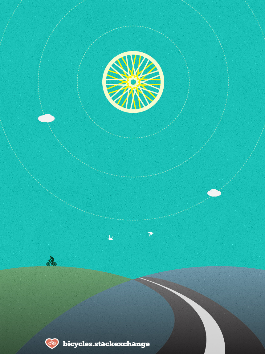
Bicycles Poster

In the picture above I'd like to see a narrower white line, to make the lanes wider. I'm glad to see you've already done that in the current design.

The above reminds me of Normandy.

Above is the poster I came up with. I believe the texture, color scheme and minimalist style work towards the goal I was aiming for. From there I transfered the visual elements onto the site design. Please keep in mind, not all of the site elements are present in these two mockups.

Ads. And you're showing the header and the footer on the same fold.

I incorporated some visuals related to bicycles and cycling, e.g. road signs and cogs. But I was careful to not to make it overly "themey." Also, I tried to fit all of the design in one image, so it looks busier than the live site will be. I'm pleased with the overall design. It did capture the feel I was going after. The site has a unique identity, while maintaining the feeling of the Stack Exchange family. I'd love to hear your feedback. If there are no major design changes, I'm aiming to launch the site next Tuesday. So an early congrats from me!

Cheers.

1
  • Thanks for the compliment on my flyer. (Free clip-art is amazingly useful!) I'll be making another one soon using elements of Jin's awesome design. Commented Aug 5, 2011 at 16:23

You must log in to answer this question.

Not the answer you're looking for? Browse other questions tagged .